Problem
Research
Existing System
Competitive Analysis
Focus & Limits
Plan
Deliverables
Timeline & Roadmap
Design
Modified Process Flow
Wireframes
Mobile
Web
Prototype
Mobile
Web
Loading thoughtful experiences…

Case study
Brindas is a multi-cuisine restaurant in Singapore. Their existing ordering experience was hard to use, driving too many phone calls for staff to handle.
Need: a food ordering app for web and mobile that simplifies discovery, customization, and checkout across delivery, dine-in, take-away, and catering.
Problem
Research
Existing System
Competitive Analysis
Focus & Limits
Plan
Deliverables
Timeline & Roadmap
Design
Modified Process Flow
Wireframes
Mobile
Web
Prototype
Mobile
Web
Brindas is a multi-cuisine restaurant in Singapore. Link: https://www.brindas.com.sg/
They take orders such as home delivery, dine-in, take-away, Tinkats, High tea, Bento, wedding catering etc. They have an existing app which isn’t so user friendly leading to so many calls which is hard to handle by the staffs. Hence they need a revamp on the same.
Need: A food ordering app for the restaurant.
List of requirements received:
Design required for web & mobile layouts
App’s Core Purpose:
Order Food
Schedule Delivery
Other Features needed:
Different Order Types
Festive Offers
Customize items
Payment & Invoice
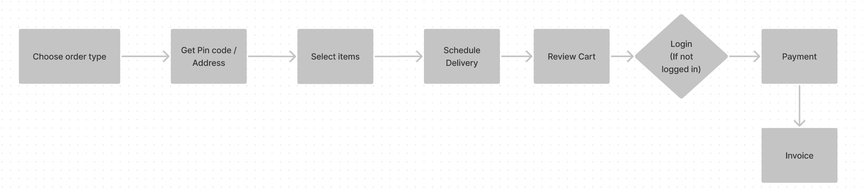
The above flowchart is an overall flow of the existing web app where the user is first asked their purpose of entering. But that’s where the problem happened. As per their data, almost half the people have actually exited the app in the first page itself and have proceeded to call.
These are reasons why users did not even cross the first page:
Too many options (Difficult to choose)
Very huge description for each option
Not inviting
The system fetches the pin code just for the delivery purpose as to estimate the minimal delivery time and thereby update delivery charges.
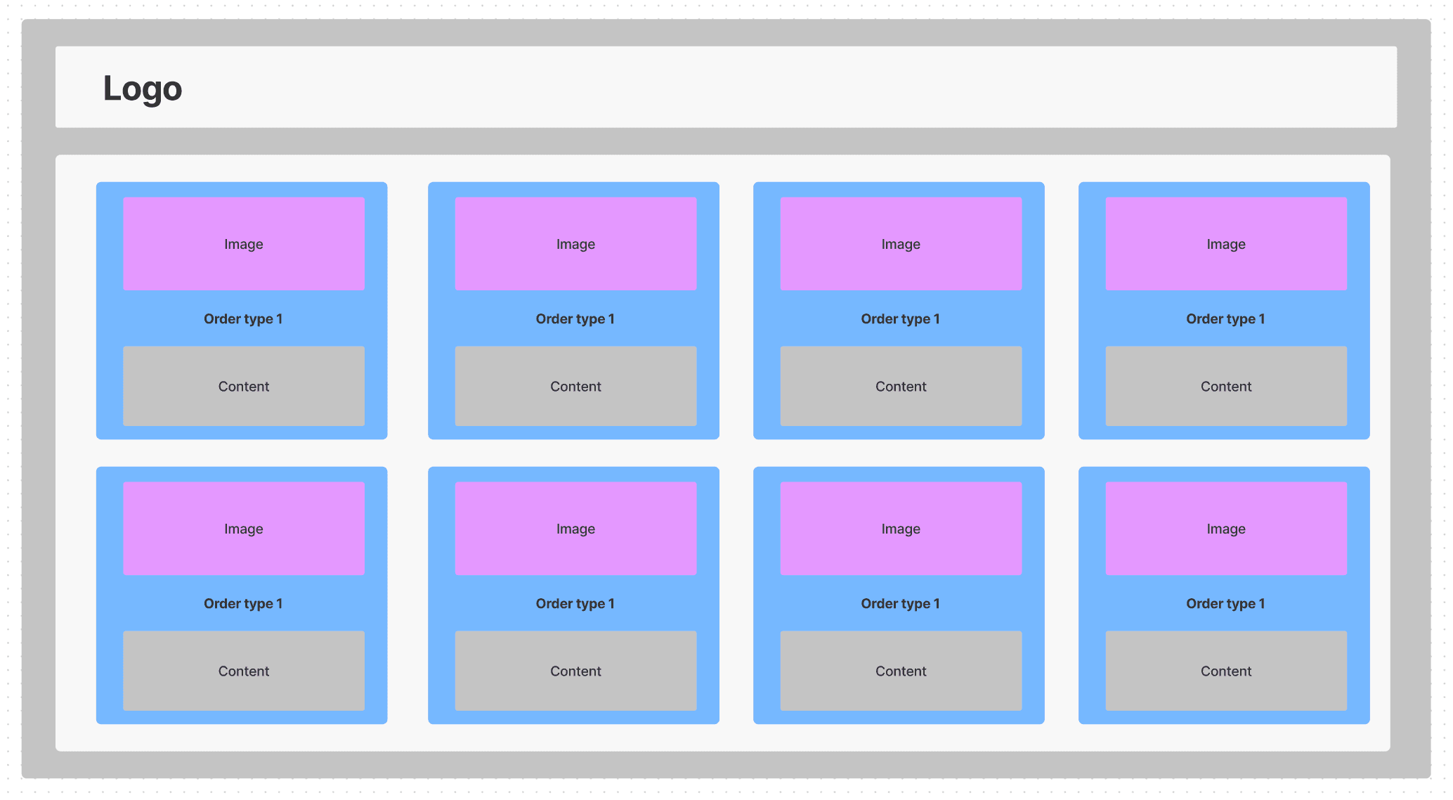
Though the flowchart says pincode and item selection are different steps, the webpage has it all side by side. The page is divided into 3 columns. 1st column had the menu categories, 2nd column had the menu items under each category and 3rd column had the cart and delivery details. The older version is not available now. Hence provided a similar wireframe for understanding.
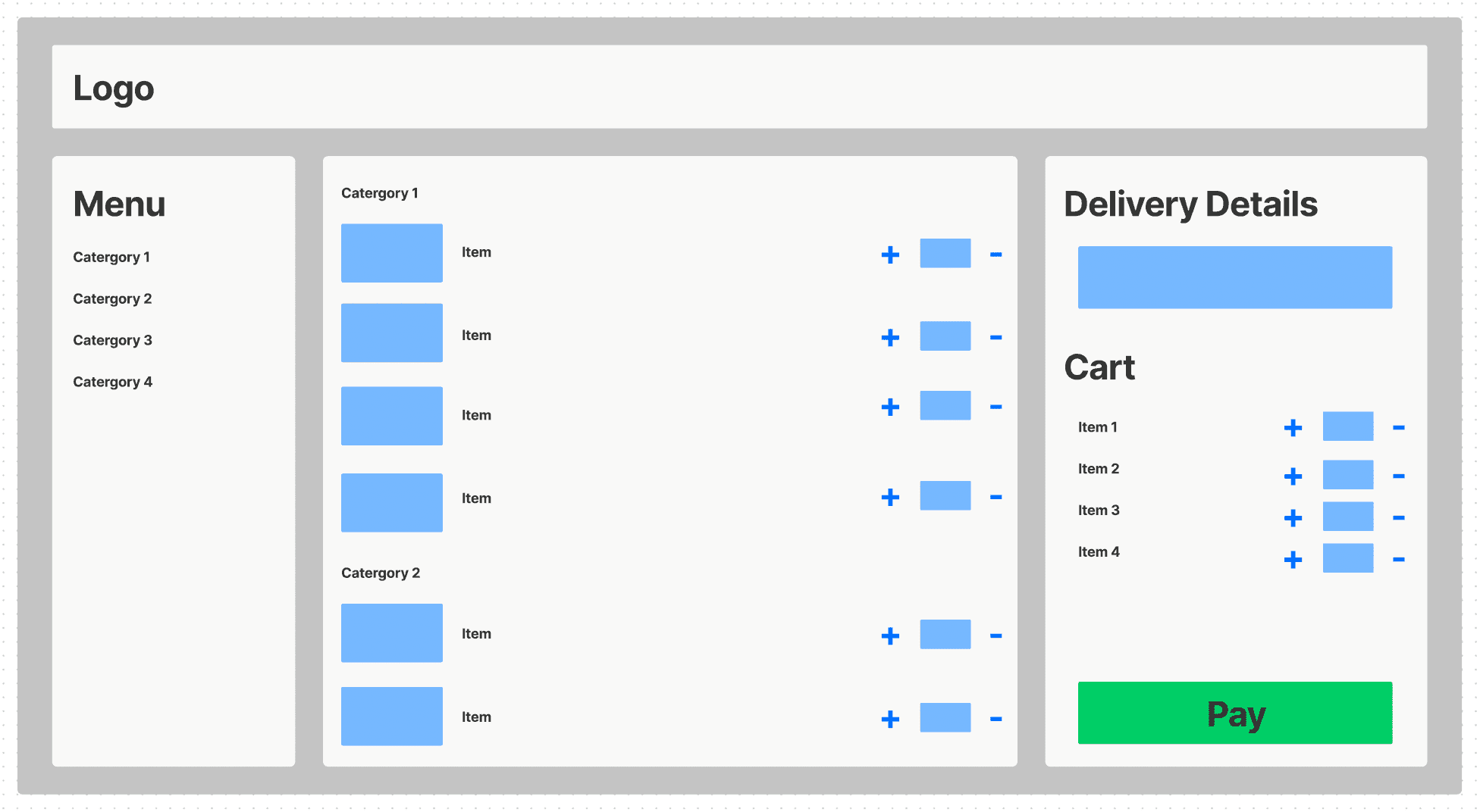
The above layout brings too much of cognitive load to the user. Though desktop has a huge real-estate, it is still distracting the user with too much things to focus at the same time.
List of apps considered:
Grab https://food.grab.com/sg/en/?pid=website&c=SG_NA_PAX_GF_ALL_LOC__PAXFOOD_NA_PAXFOODBOOKNOW&is_retargeting=true&af_force_deeplink=true&af_sub5=organic&af_ad=PAXFOODBOOKNOW
Swiggy https://www.swiggy.com/
Zomato https://www.zomato.com/
Grab
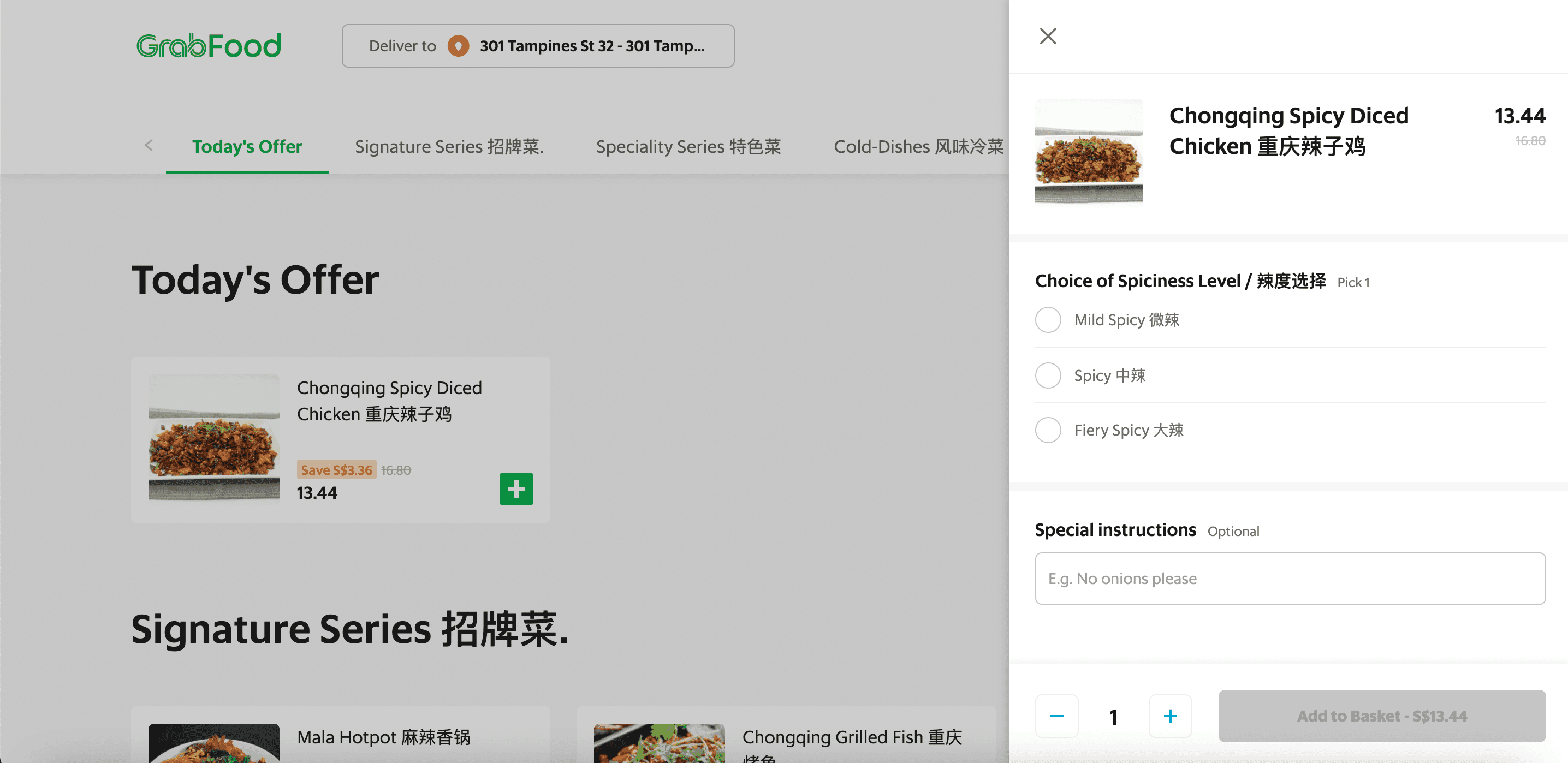
Though there are many other apps that can be taken for the analysis, Grab was the one grabbing the attention of the client. The client wanted a ‘sliding tab bar’ for categories and items to be kept scrolling under the bar.

And cart inside a slide in would make it easier in web. And the client wanted a similar layout as grab was one of the most used apps in singapore.
Swiggy
Not suggested by the client, but certainly something I loved using so far. Swiggy does not exist in Singapore. But it is the most used food ordering app in India. So planned to take some inspirations from it. The main ingredient that grabbed my attention was the flow.
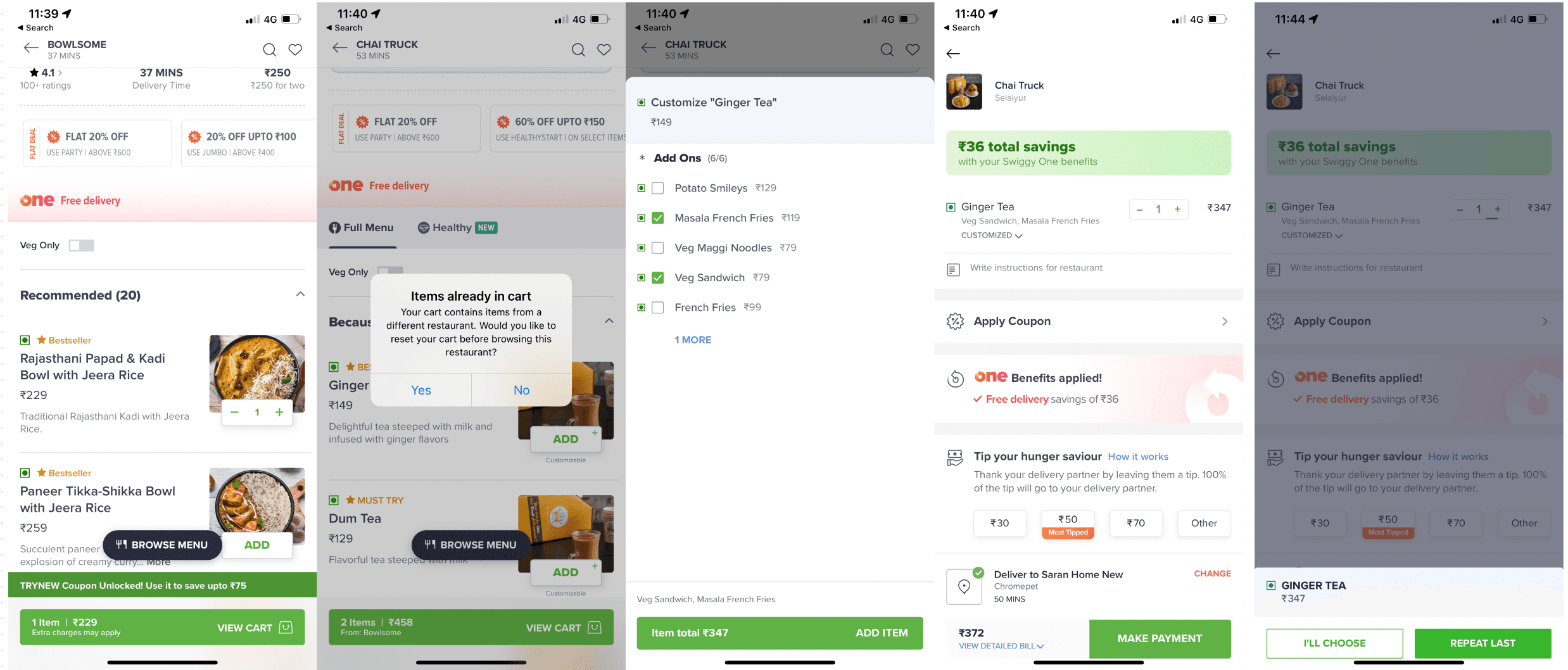
Step 1: Pick an item from a restaurant
Step 2: Go and pick an item from another restaurant (You will get an alert to switch)
Step 3: Pick an item that has customizations in it (Modal opens to provide your customizations)
Step 4: Goto cart and edit (Removal is done as is, but adding will ask you to repeat the same customization or choose a new one)
The above method of handling such scenarios was very clear with swiggy when compared to the rest.
Zomato
Zomato has the largest market compared to any other food ordering app in India. But its not my personal favourite due to its cluttered appearance. Offers in swiggy are better. Anyways, coming to the point, zomato had a better way of approaching people. Asking where they are from, first and then letting them discover more if they scroll.
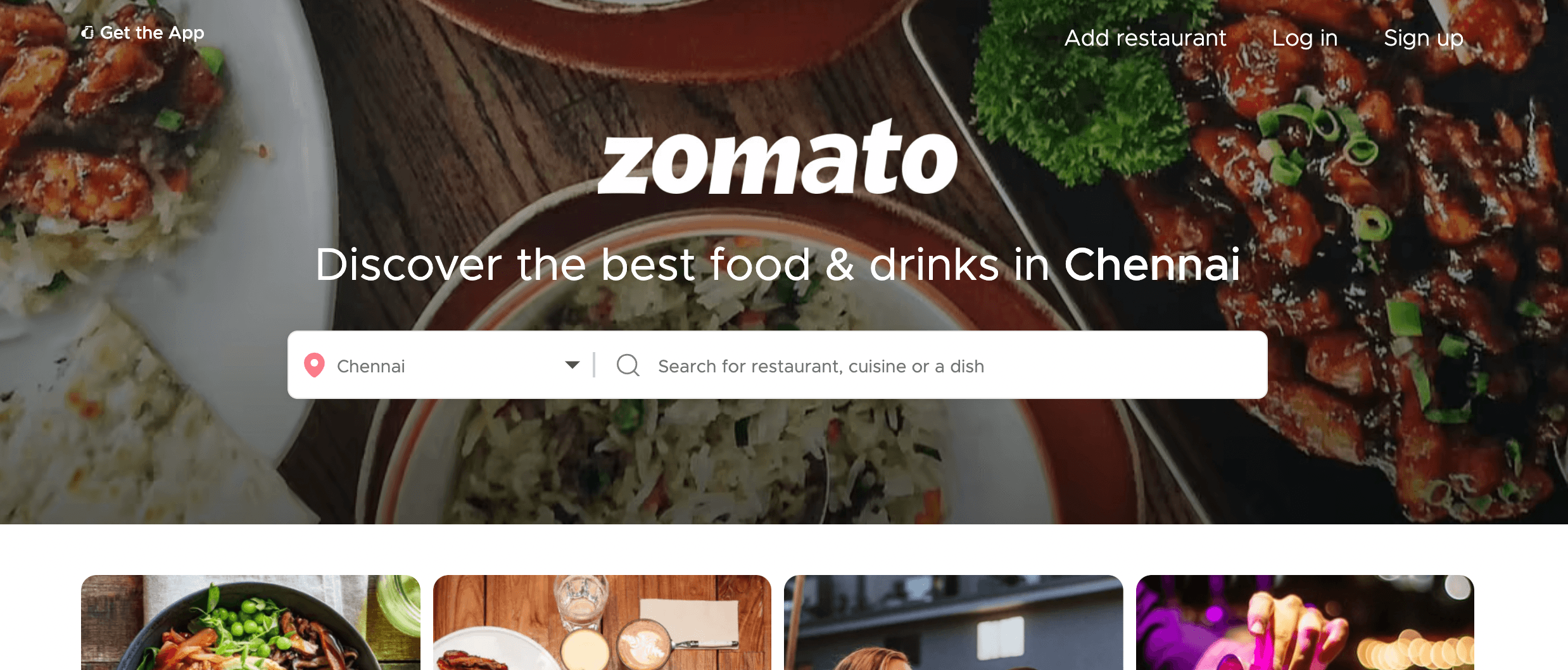
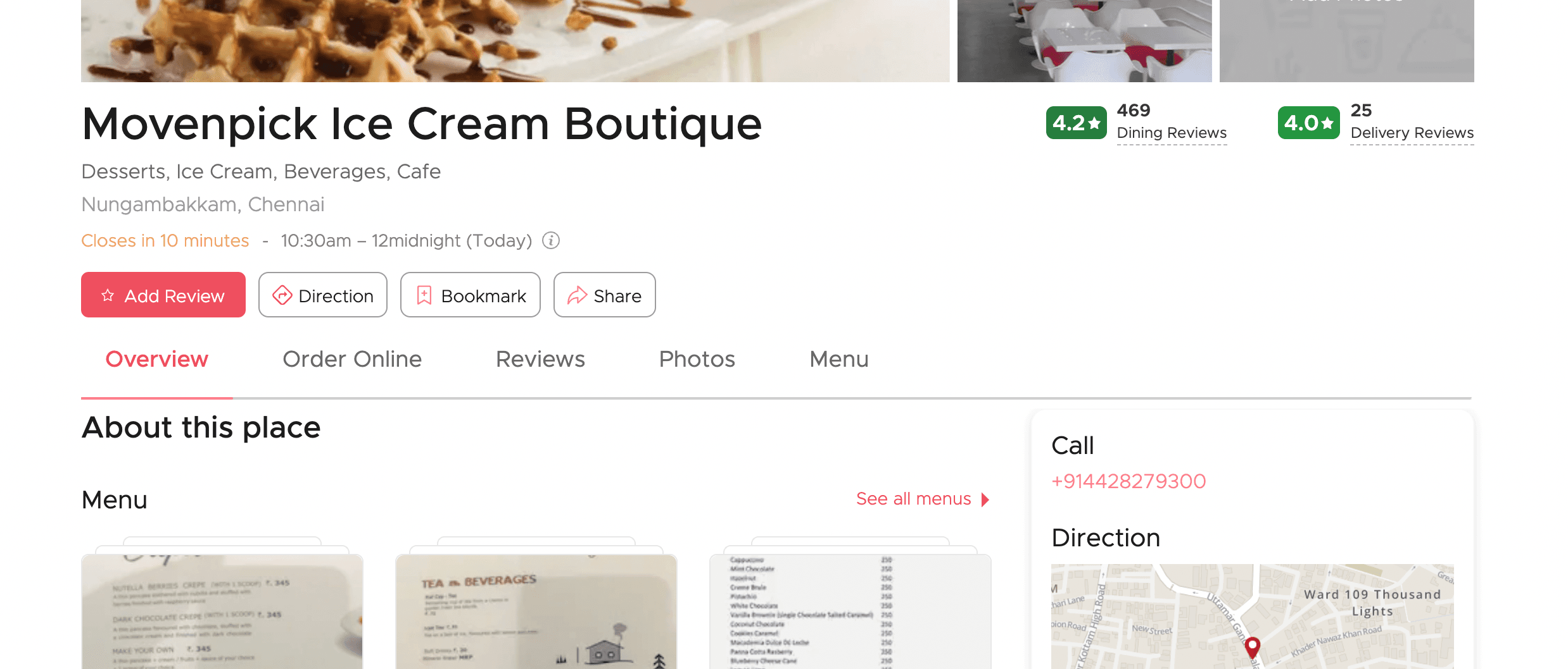
Zomato now has a cleaner UI which wasn’t appealing a year ago.
Compiling all the learnings inspirations from various apps, it was clear that client has no idea about how the mobile version should be. I received lot of expectations from the client end with respect to the web version. Nothing was related to the workflow of the app, but just the UI part.
Asking a few more questions from the client regarding how the work, I received some good answers why these approached should not be altered.
Type of orders Question: Can the user choose the purpose (instead of order type) so we can guide the user with set of items they can throw in their menu? Answer: No. It should be order type only. As items and min. item count are restricted for every type. And it will have a significant hit on the cart value.
Item wise comments Question: Why does every item in cart needs a comment other than overall comment? Answer: Because the staffs who pack the items will get confused. There can be scenarios to give in different carry bags. Just to make sure which goes with what.
Order tracking Question: How does order tracking work? Will it have live tracking of the delivery person? Answer: No. Not as of now. Order tracking is available through app, SMS and call that the order has been dispatched. No live tracking as of now due to budget constraints. But there are plans to add in to scope in upcoming versions.
OTP verification before payment Question: We already have user’s contact. But why we need another contact for delivery address and also the OTP verification? Answer: There are people who order huge amount of food for people they want to take revenge on. Hence if a person orders for another person, the other’s person’ consent is needed so Brindas can prove if receiver claims that did not know who ordered it. The OTP is the way to confirm if the other person is fine with the order.
The major difference between all the above three apps and Brindas is that Brindas app is dedicated to that one restaurant. And that itself explains why the client doesn’t want to jump in to live tracking at the moment.
Target: Audience : Anyone Demography : Singapore Age : All Gender : All Devices : Desktop (Starting from 1024 x 768 to 2K display) & Mobile (iPhone 5S to XS Max)
Tech details:
Front End : Angular + HTML/CSS
App type : PWA (Progressing web app) / Responsive
The app is basically web, but have to cater android and ios users as well. Hence I made sure to stick on with common elements that are used in both the OS’es. And it is clear that the customer needs only upto the invoicing part and no live tracking needed.
Timeline & Roadmap
Modified Process Flow Diagram
Wireframe
Prototype
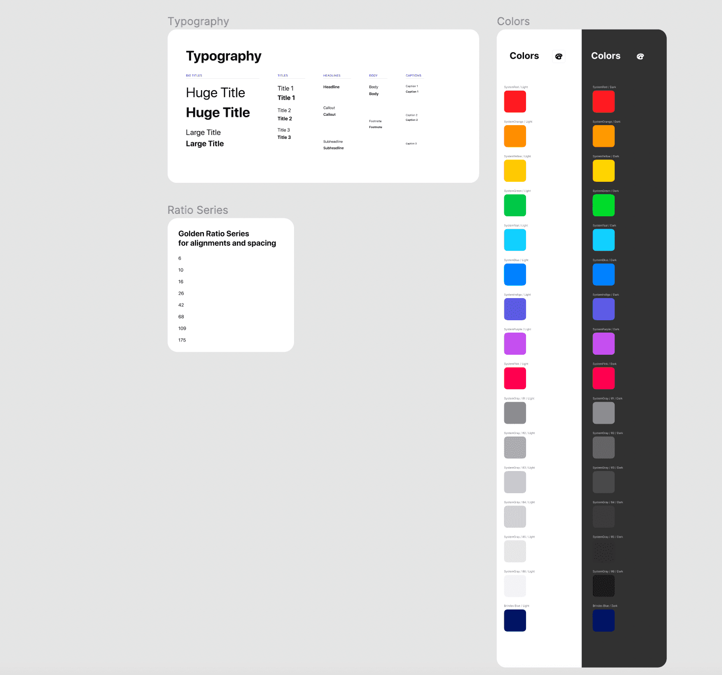
Design Language
Color Palette (Light & Dark)
Typography)
Duration : 8 Weeks
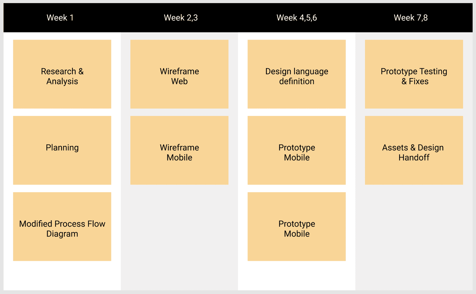
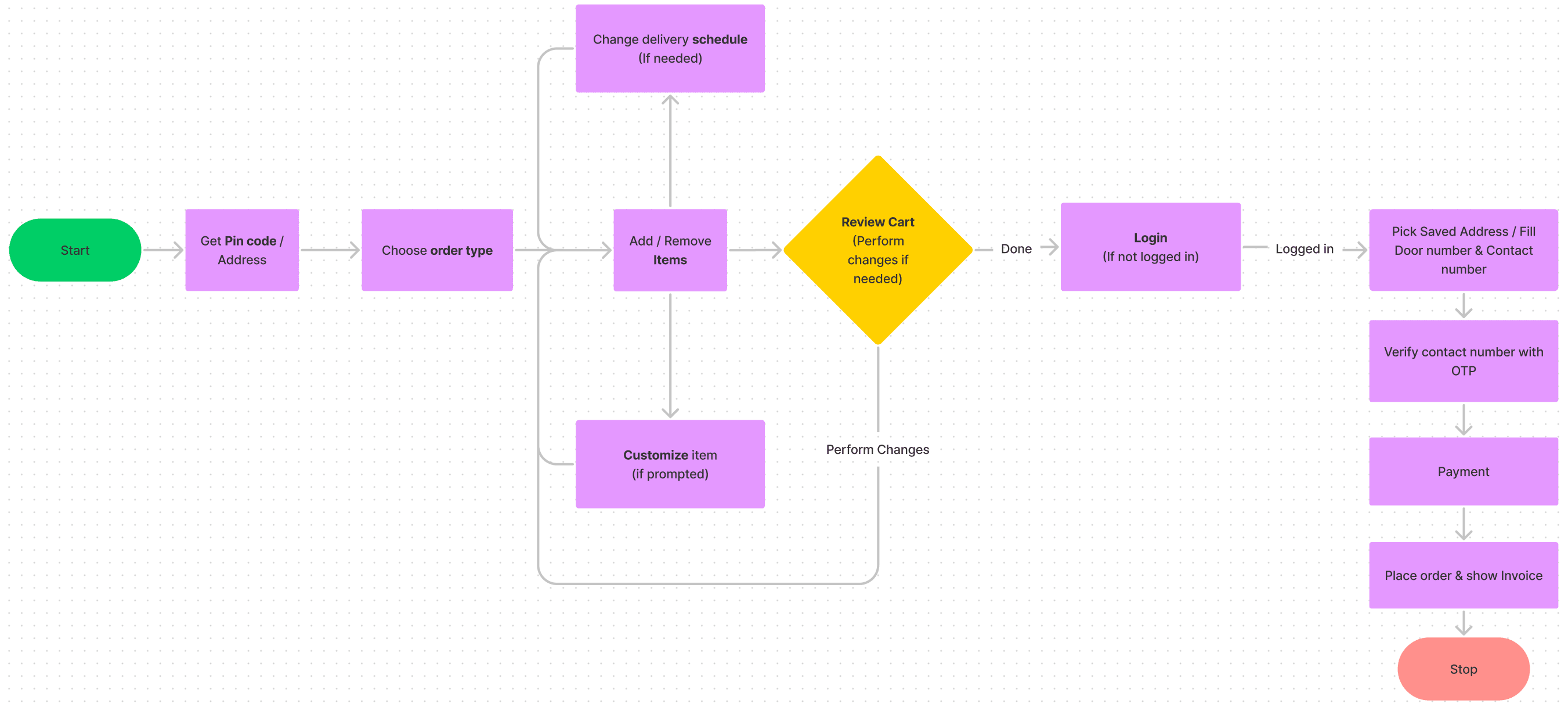
The process flow has been altered based on the questions asked in the ‘Focus & limits’ part. It made more sense to ask Pincode before choosing order type as it will take user gradually into the core part. The first two steps will prepare the user what they will be looking in the third screen (item selection).
User will progress further towards delivery and payment only if logged in. As the user may have saved address where they may have to set delivery to.
Wireframes were created based on Mobile first approach.
i. Mobile
Below is a preview of the whole wireframe in mobile. By understanding the flow on screens in mobile, it will be easier to understand the same in web.
 Google DriveBrindas Mobile app wireframe.pdfGoogle DriveOpen
 ii. Web
Click the below link to view all the screens for the web layout.
drive.google.comdrive.google.comOpen Google DriveBrindas Wireframe Web.pdfGoogle DriveOpen
 The prototype has comments to convey reasons why that part has been design that way.
Architechture: Main Screens - Landing, Order type, Item selection, Profile, Cart (Mobile)
Modals (in mobile) / Slide ins (in web) - Payment, Customize, Change address, Cart (Web)
The reason to push cart in slide in in web as there is no necessity to give cart a full screen in web as it accommodates lesser space. And the same to push it as a main screen in mobile is because it is added to the bottom navigation for easy access.
i. Mobile
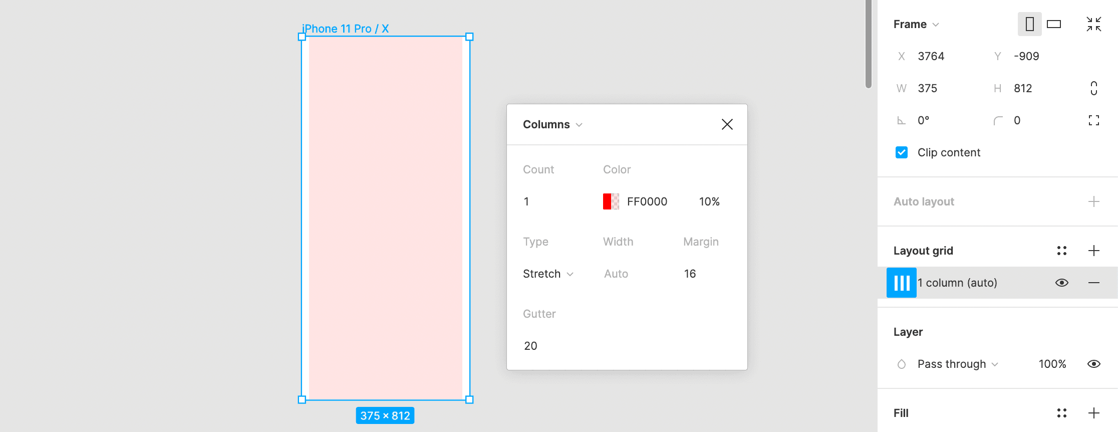
Chose iPhone 11 Pro as a benchmark device. The Grid settings is as follows.
The design language is added here, which is a common entity.
Click the below preview to view Mobile Prototype.
 FigmaBrindas - MobileOpen embedded contentOpen
 Click below link to interact with the prototype
 FigmaBrindas - MobileOpen
 ii. Web
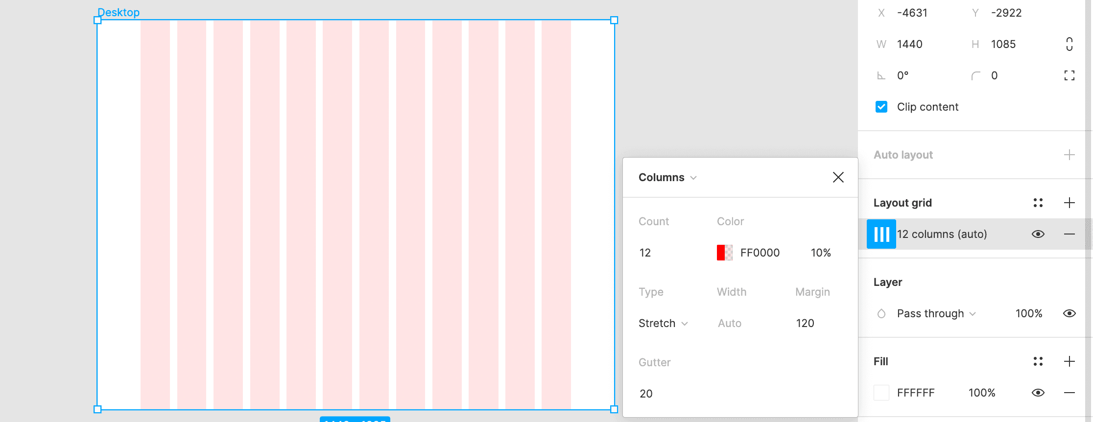
Chose 1440 x 1085 as a benchmark resolution for desktop. The Grid settings is as follows.
Click the below preview to view the Desktop prototype.
 FigmaBrindas - WebOpen embedded contentOpen
 Click below link to interact with the prototype
 FigmaBrindas - WebOpen
 Final App
‣ - Orders Page