Require a Mobile live Streaming app which is minimal and user friendly welcoming everyone into mobile streaming career.
Loading thoughtful experiences…
Loading thoughtful experiences…

Case study
Require a Mobile live Streaming app which is minimal and user friendly welcoming everyone into mobile streaming career.
Competitive research across Stream Champ, Omelet, and PRISM Live shaped a simpler onboarding-to-stream flow for beginners.
Require a Mobile live Streaming app which is minimal and user friendly welcoming everyone into mobile streaming career.

Apps taken under consideration

Key Features:
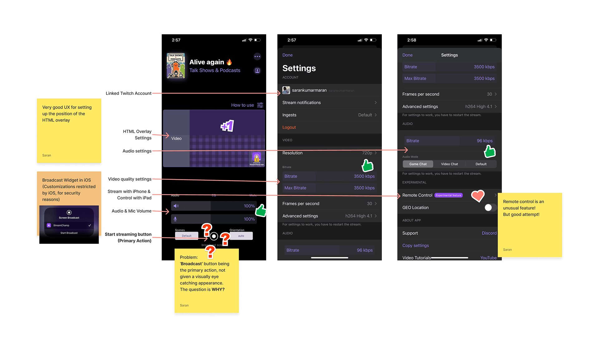
1. Custom HTML Overlay (Choosing & Positioning)
2. Advanced Audio & Video settings
3. Manual control for stream orientation
4. Super friendly for beginners
5. Embraces every feature twitch streaming
6. Easy access to anything the streamer wants in the app
7. Remote Streaming
Shortcomings:
1. Broadcasting being the primary action, the 'Start broadcast' button is not prominent
2. Supports only direct streaming to Twitch
3. Settings is a bit cluttered, but better than others
Reason for the 'Start broadcast' button being small:
iOS gives developers a dedicated button to call the 'Broadcast' Widget which will ask the user to select. Unfortunately there is no API to set a different button to call this widget. Hence the developers are restricted from customising this button and actions. And the reason iOS has been this way is to avoid any privacy breach happening in between while streaming. iOS will automatically redact the sensitive information from screen while streaming (Ex: Password while typing).
Key Features:
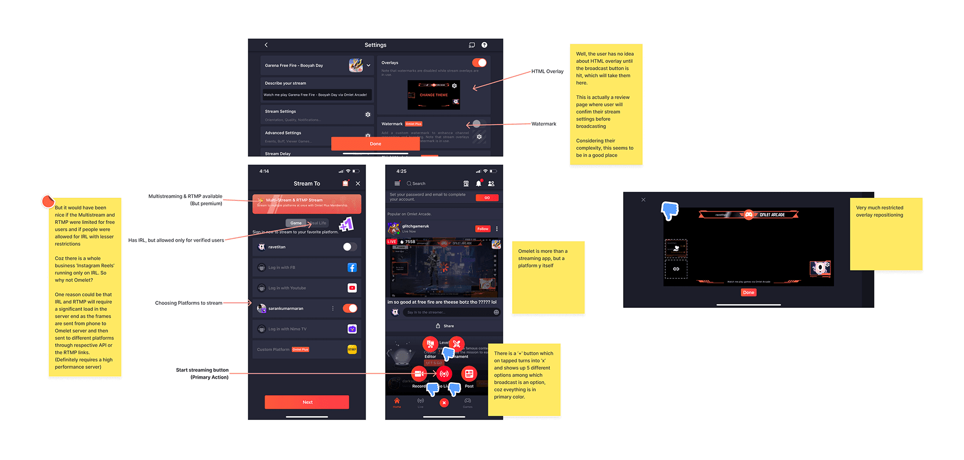
1. Custom HTML Overlay (Choosing only)
2. Advanced Audio & Video settings
3. Embraces almost every feature in every platform
4. Multi Platform streaming
5. RTMP
6. Has its own platform as well
7. Custom Watermark
Shortcomings:
1. Very cluttered UI making it difficult for beginners
2. Similar 'Broadcast' button issue
3. IRL is not for everyone
4. Too many steps to start a stream
5. No support for Portrait mode, supports only landscape
RTMP stands for Real Time Media Protocol. Users will usually have to sign in with Twitch, youtube or any platform they want to stream to. This method uses HTTPS protocol and API calls. But for RTMP there is not need to login, but instead there is a 'Stream Link' and 'Stream Key' dedicated for each individual user in their platforms. The RTMP is used only for Streaming Live content.
It is a feature which enables to stream to multiple platforms simultaneously. It is not a technology, but an in-app feature which is necessary for any upcoming streaming app.
Key Features:
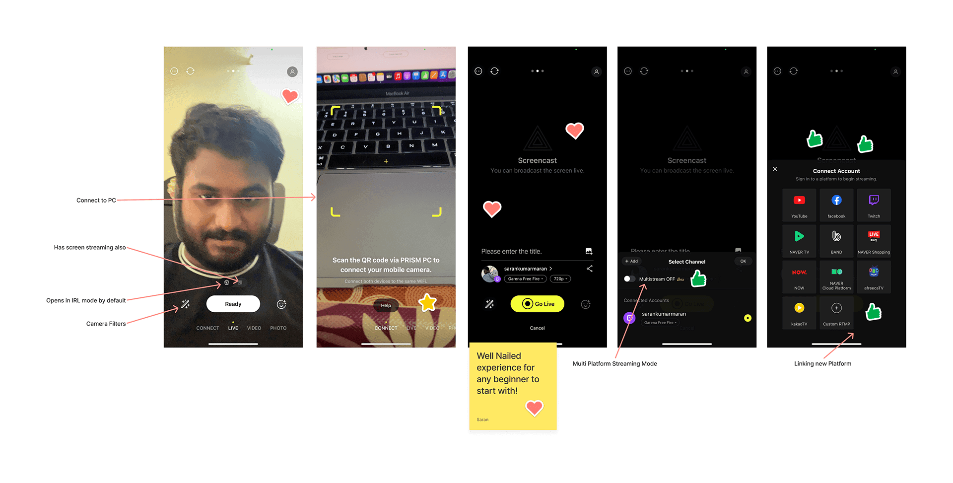
1. Overlay Stickers (Similar to HTML overlay)
2. Audio & Video quality settings
3. Multi Platform streaming
4. RTMP
6. Pre-filled RTMP stream links based on the platform
7. Fool Proof UI
8. IRL is for everyone and not restricted
Shortcomings:
1. Does not allow user inside app without giving all permissions (Privacy issues)
2. No HTML overlay frames
3. Though they have attempted to nail the experience, the modification of the ‘Broadcast’ button lead to a malfunction where they are unable to call the ‘Broadcast widget’
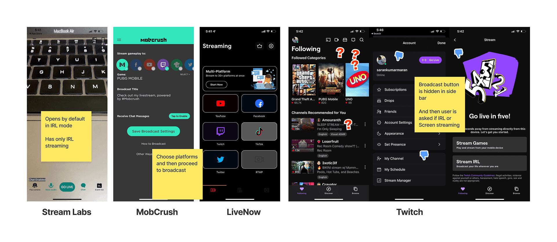
These were some examples we learnt ‘What not to do’ in terms of UI. Going live is a big challenge in Twitch, Livenow and Mobcrush. Livenow has only RTMP which makes it practically unusable for beginners. Stream labs is easier in experience wise, but inconsistent UI wise and has only IRL.
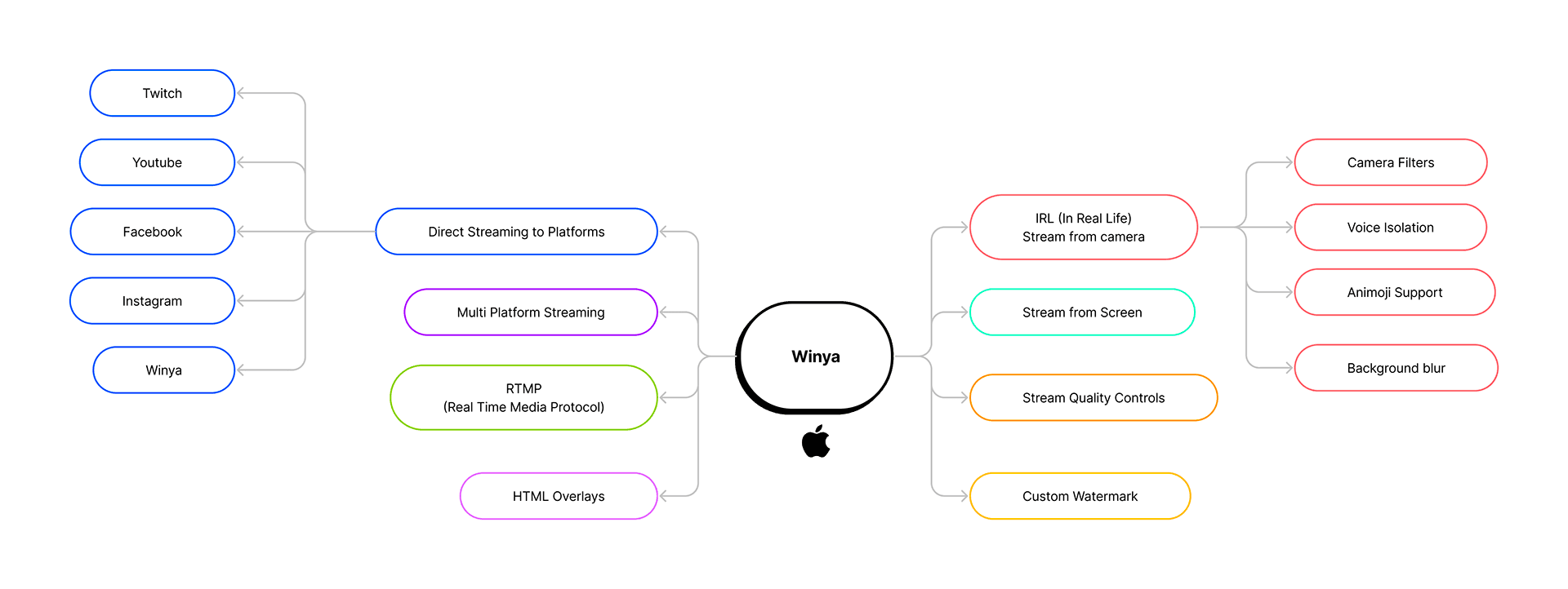
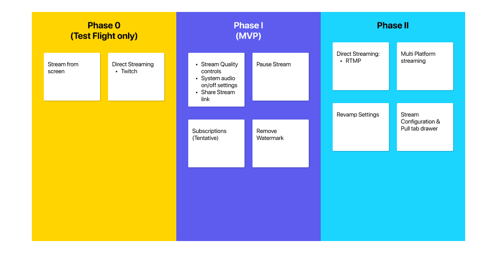
The idea behind Phase 0 was just to check the feasibility and scalability in the development end, which is the reason it remained only as a test flight version and never released in market. Unlike most of the apps starting all the way up from design end, Winya originated as an idea from the developers where one of them was testing the APIs of Twitch and required a basic UI to check whether integrating that API would be a success. Phase 0 became a success and led us to Phase I where we were confident enough to bring some more features into the app that can make it an MVP.
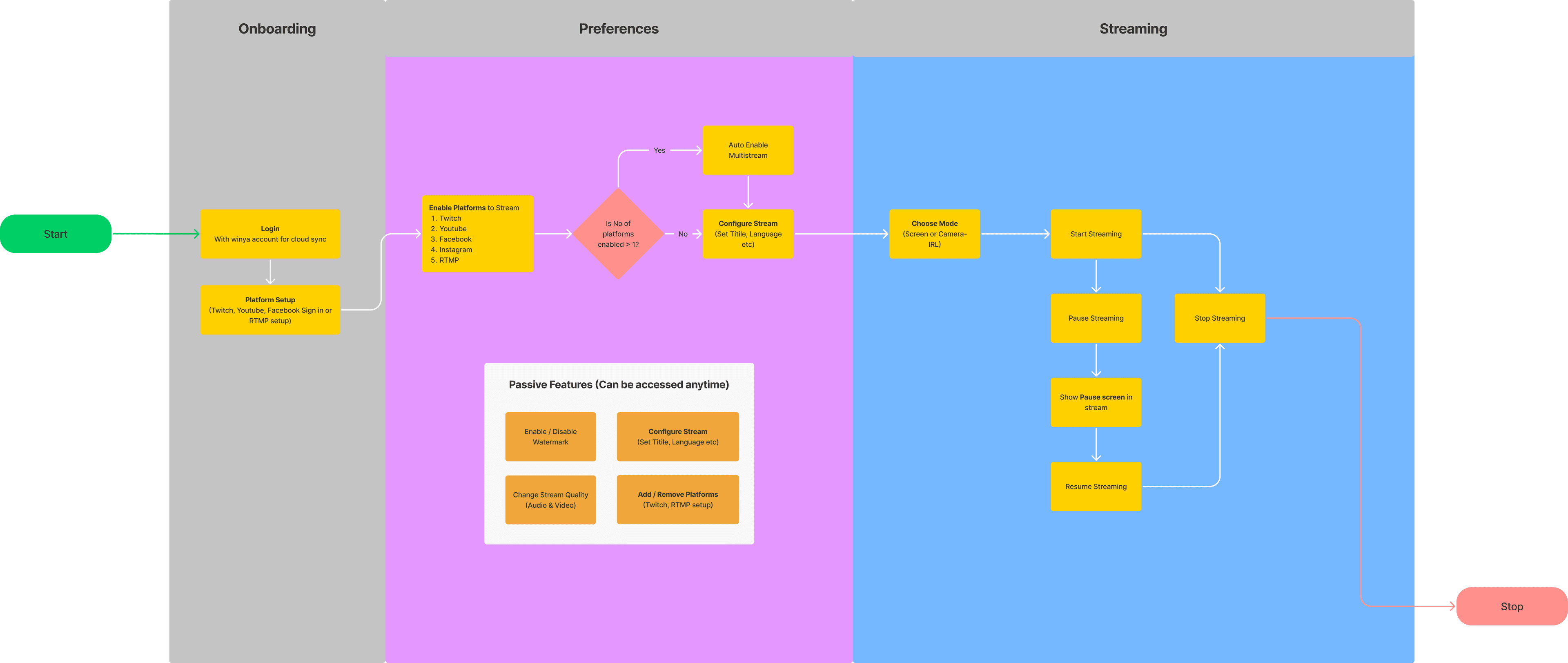
Considering the user experience of the competitive apps, we made a strong decision in phase II to make sure the process is simple enough for users to use the app atmost. The app's flow is divided into 3 segments (Onboarding, Preferences and Streaming). Most streaming apps didn't focus on onboarding after logging in. Instead, they focused over a simple walkthrough. The problem faced due to absence of onboarding is users don't know how to setup a platform. And the problem with walkthrough is they are mostly skipped. Which is the exact reason we made sure to help user setup at least one platform during onboarding as they will be accustomed to a similar flow planned inside. The user flow diagram has been planned based on all the functionalities to make sure which comes where so tasks can be prioritised by developers with a wider vision.
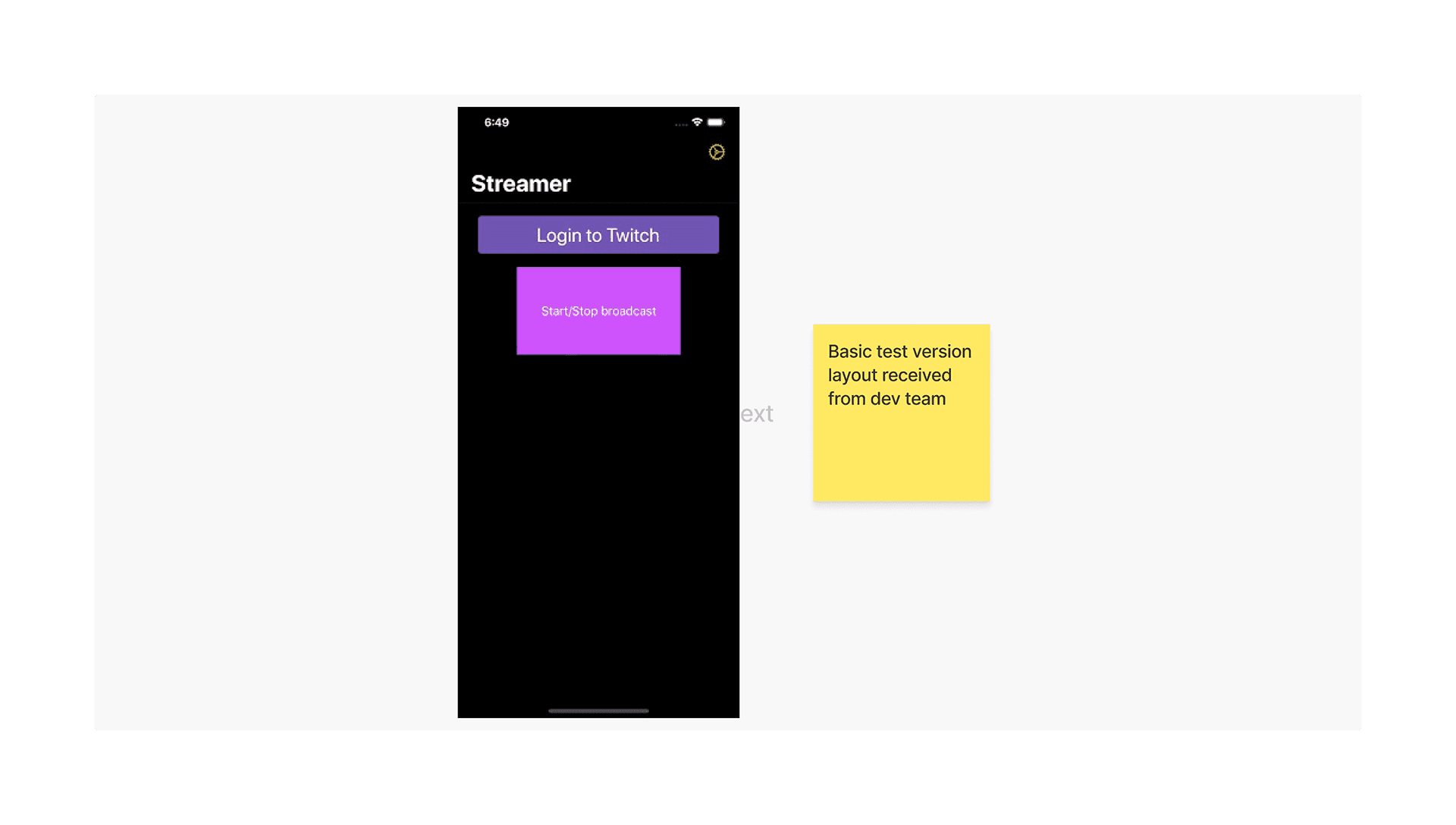
This was the first working version given to us by the devs when Winya was just an idea.
There were two things looked onto:
1. Twitch Streaming
2. Modifying the appearance of the 'Static Broadcast' button
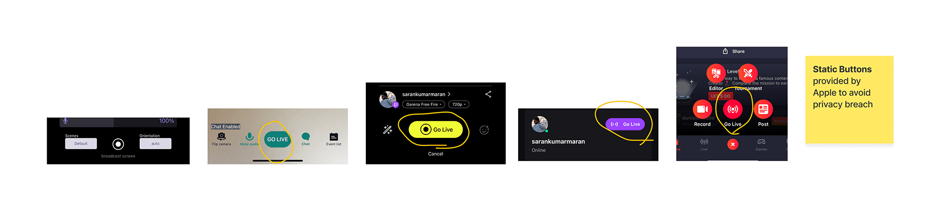
And it did work. Our devs achieved with a minor UI level modification with which they were able to change the appearance of the iOS's default static broadcast button (Thats something others could not achieve).
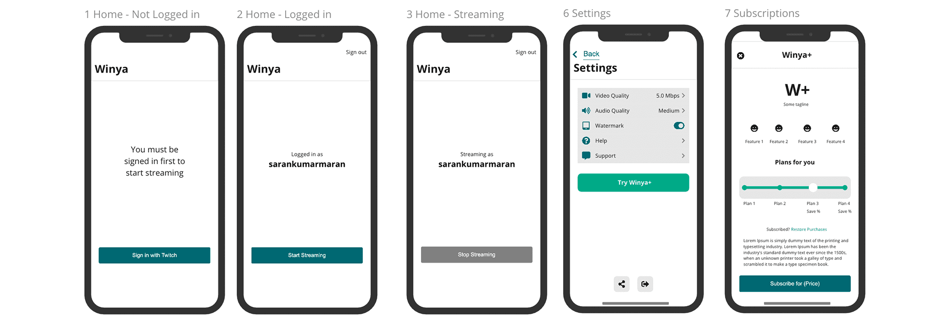
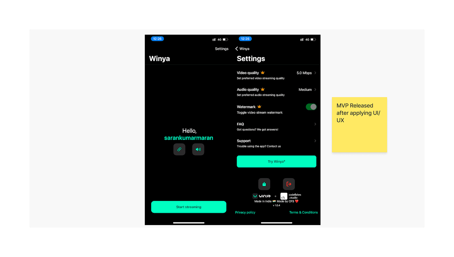
Having our test version succeeded, we progressed confidently into other features such as pause stream, stream quality and watermark which were decides to be premium features in the app. The Subscription screen idea was to make sure the user is not lost once visited. We have only a few seconds of user's valuable time to convert into sale. We made sure there is no scrolling for the user to discover all the plans (benchmarked to SE 2 screen size) and there is not more than 2 interactions (selection & confirmation) on the screen.
"Start Streaming" being the main call to action button, we have placed somewhere between the bottom and middle of the screen so as to increase reachability of the thumb with minimal effort compared to the other apps. The other buttons (copy link & system sound on off) are both set a little higher up as they wont be accessed often by user.
Pausing feature was one of our UBRs as many did not achieve this kind of behavior.
If ‘Start Streaming’ → Pause & Stop buttons reveal, hiding Start Streaming, screen says “Streaming through <accountid>”
IF ‘Pause’ → Pause changes to Resume, Screen says “Paused”
IF ‘Resume’ → Resume changes to Pause, screen says “Streaming through <accountid>”
IF ‘Stop’ → Start Streaming button reveals hiding the rest, screen says “hello <accountid>“
Certainly not a UI challenge, but an implementation challenge which no others were able to solve & achieve. And to our surprise, it even passed the review and Appstore did not reject our implementation method as it involves visual modification of the button itself. Coz we made sure the privacy is not compromised anywhere in between due to our modification.
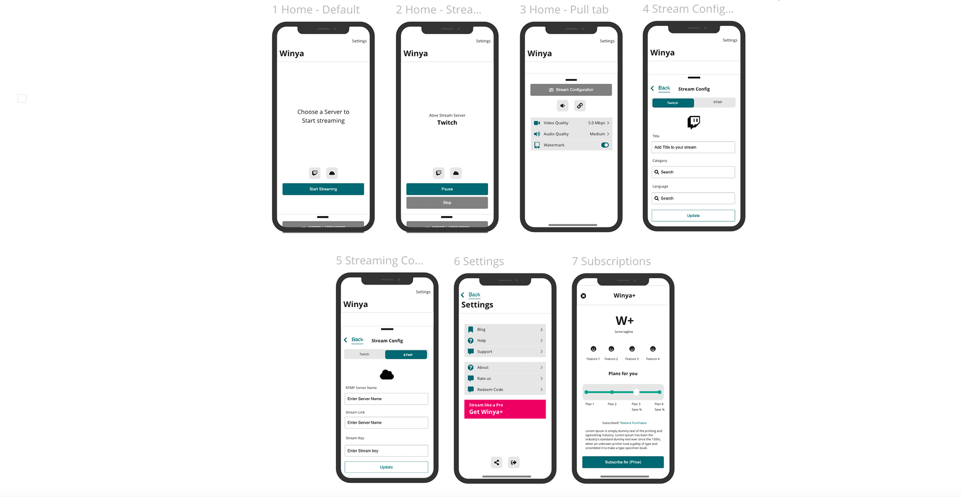
Further to the success of Phase I we proceeded to add more features into Phase II as planned in the road map. RTMP and Multi-streaming took lead in this phase where came another necessity which we wanted to test. We interviewed streamers and came to know that they were expecting a way to change settings while they are live. So the challenge was to bring them every control upfront without cluttering the screen so there wont be much of cognitive load. That's where we adopted the 'Pull Tab' approach where user can pull it out anytime like a kitchen drawer and close when not needed without leaving the parent screen. Anyways it was an experimental approach we wanted to try for this phase. Having the "Start streaming" button in the right place, the user will be shifting platforms without stopping the stream. And hence we have placed platform selector right above the call to action.
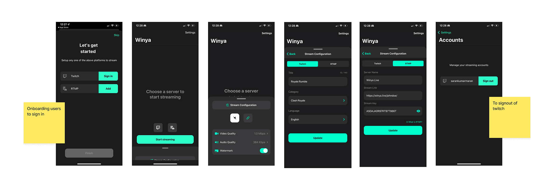
Though the pull tab seemed to be an efficient solution here, the dev team faced a tremendous issue implementing this behaviour. No native element was pre-defined in iOS Library for the pull tab behaviour.
AppStore Link:
apps.apple.comapps.apple.comOpenThese were the main challenges faced in Prototyping to make sure our design is “Inclusive”:
The UI part has been design using ‘Flakes Design System’ which is inspired from the ‘Human Interface Guidelines’ so as to make sure there is minimum level of customised code for accessibility.
The dark mode is engineered specifically for Winya so there is no contrast issues for any colour blind user.
Font accessibility is taken care by the system itself due to the use of default System font (SF Pro Display).
The app is localised in more than 5 languages to reach a wider audience. Words were carefully chosen and size altered to make sure there is minimal risk of overflow after localising to russian and increased font size.
UX writing was done to make sure every term is simple and understandable even by users who are new to streaming career
This app was designed for Code Flakes Studio

